
The Explain tab helps you to understand how and why the model predicted a certain way. This is especially useful when the model is not behaving as expected and has to be retrained to achieve optimal performance.
Explainability through the Explain tab serves three purposes:
🔍 Identifies the root cause behind an unexpected prediction or a monitor violation
🔮 Enables users to foresee upcoming turbulence in performance through selected data patterns
⏳ Reduces time-to-resolve issues and guards end-users from downtime or faulty results
You can either investigate a prediction after receiving a violation alert from
Censius monitors or simply go over a couple of predictions in the Explain tab to check the sanity of the prediction process.For this particular guide, we will pick one of the standard performance monitors, accuracy, and assume that we are investigating an accuracy monitor violation.
Explaining Accuracy Monitor Violation
Once you get a violation alert, enter the Project. Click on the specified model version to enter the Monitors tab and select the monitor that has been violated. A line graph will appear on the left panel and the violated section will be highlighted. Note the data segment of the violation and move to the Explain tab
The Explain tab has three sections, each for a specific purpose:
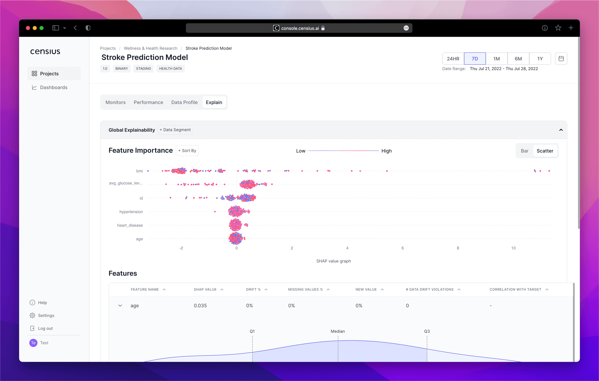
1. Feature Importance
Understand which features are impacting the model decisions the most globally or in a particular data segment
Through the feature importance section, you can:
- Visualize SHAP values* through both bar and scatter plots (toggle)
- Analyze global feature importance or pick a specific/sensitive data segment to see feature impact
- Sort the visuals in any order and hover over the plots to view exact values
SHAP or SHapley Additive exPlanations are values calculated by comparing the model output with and without the feature in question. If the difference is minimal, the feature is considered to be inconsequential.
🪧 Directions
- Select the data segment in the
Global Explainabilitybar and notice the order of the features in theFeature Importancegraph.
- Note the features with the highest SHAP values (in either +ve or -ve direction).
- For a more detailed analysis, toggle to the scatterplot and note down the exact values.
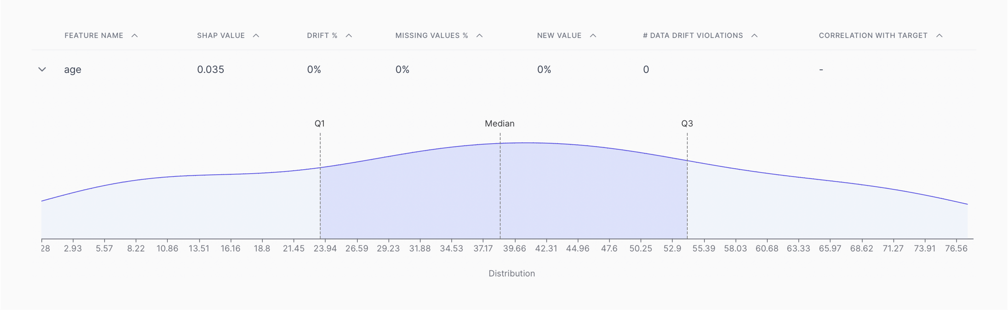
2. Features analysis
Take a look at critical parameters of the most impactful features and analyze their distributions
Through the feature analysis section, you can:
- Assess critical indicative parameters such as correlation, SHAP value, drift%, missing value%, new value%, and number of drift violations
- Expand each feature to observe its distribution across the four quartiles and detect anomalies, if any
🪧 Directions
- Move down to the
Featuressection and check for indicative parameters such as correlation with the target variable and drift%
- Note the features with the highest values of these parameters and note the ones that intersect with the features with high feature importance
- Expand on the features of interest and check for outliers or changes in distribution through the data distribution graph
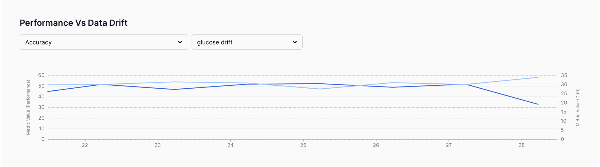
3. Performance Vs. Drift comparison
Evaluate the relationships between performance and drift to find causal patterns
With the performance vs. drift section, you can:
- Find causal patterns between disruptive performance and data/concept drifts
- Detect triggering patterns that could impact model performance in the long run
🪧 Directions
- Move to the
Performance vs. Data Driftand view the data drift graphs for the shortlisted features from above (one at a time)
- Correlate the drift patterns with the overall model accuracy (available in the Performance Metric dropdown) and look for causal patterns such as dipping accuracy whenever drift is high.
Outcome
After running the above process, depending on the data, you will have clear information on the following:
- Which features are causing a performance dip?
- Why are the features causing a performance dip? (outliers, missing values, new values, etc.)
- How is the performance changing with drifting data?
- Which exact data segment should the model be re-trained for?
You can run a similar investigation for all disruptive violations including performance dips, data drifts, biases, and poor data quality to understand the root cause of the issues.